I’ve been collecting various marketing components all year. I started out with temporary solutions in every category until I could put my efforts into creating something unique and personal.
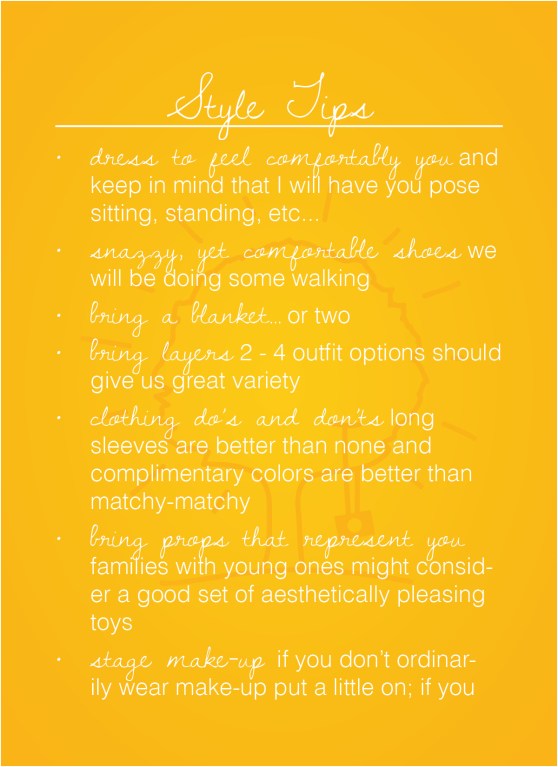
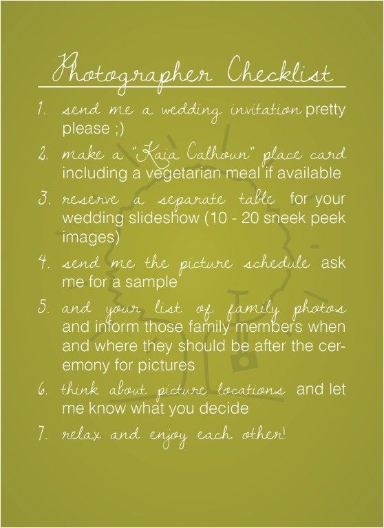
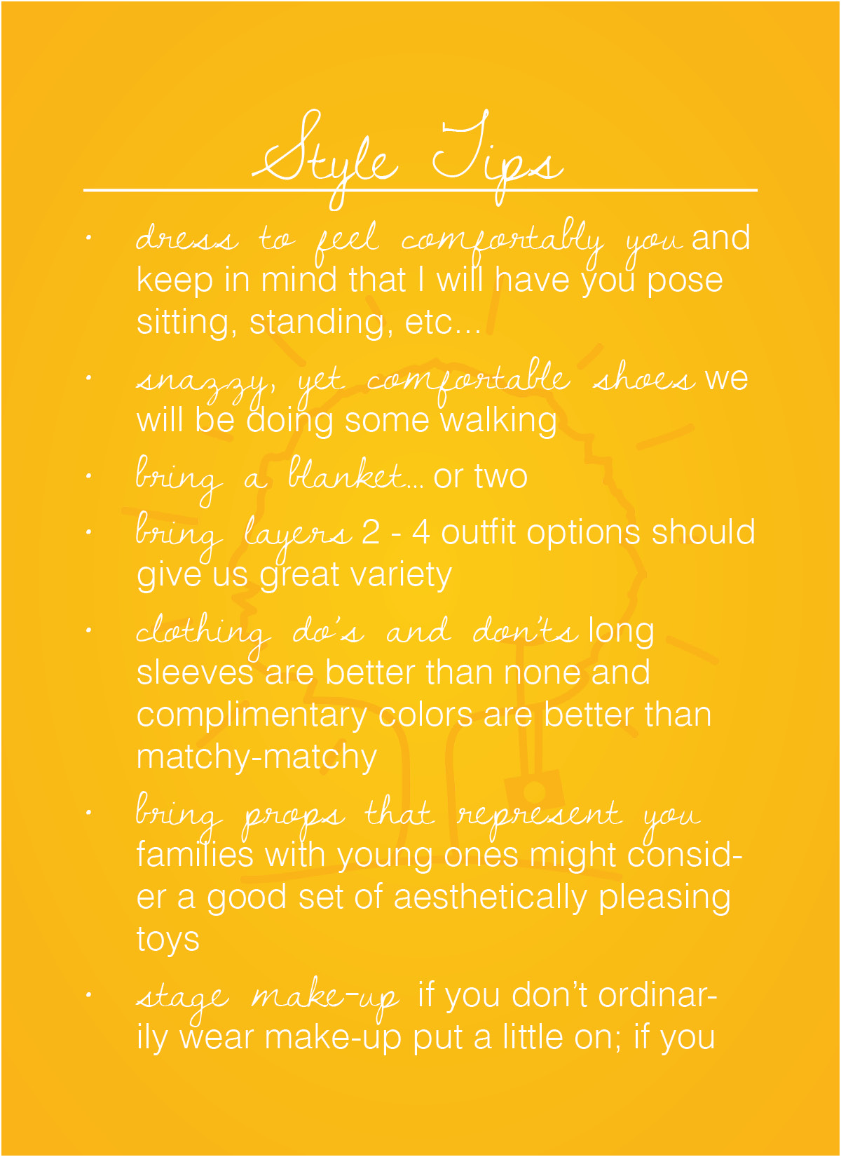
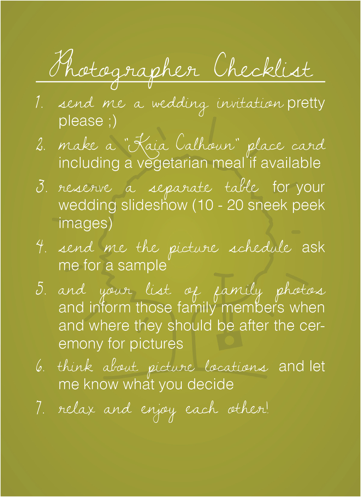
One of my most important pieces in my branding material is my welcome packet and the items I include in that. It is important because they are all the answers to any questions my clients usually have about a session. What should we wear? What props should we bring? What else do you need from us?
To my wedding clients I sent out a card with my “Style Tips” and “Photographer’s Checklist” postcards and a basic, handwritten greeting card. To all of my portrait clients I simply email the “Style Tips” PDF to them after they complete the contract and deposit.
To design these post cards I stuck with my design model: simple, natural, and colorful. To over complicate design makes it harder to read and messy. I decided I would stick to my two regular fonts for the little variety I wanted, my logo, and my colors. My natural component is the handwritten card and the envelope. My card is a natural brown like my disc packaging and the envelope is a stark white to go with my website (it is also the neutral color in my chosen color palette). And, since I have had my color palette all sorted out for several months now, choosing colors was easy. I had six choices to work with: stark white, natural brown, yellow-orange, rust red, leafy green, and sea blue. I always keep the yellow in the mix because that is my main color and then I chose the green because I liked the way that would pair with the yellow and I didn’t use it in my marketing materials yet.
A full blog post of what the whole Wedding Welcome Packet looks like will be coming soon 🙂